

Dart & Partners, South Devon.
A long-established agency on the Teign estuary with three sales branches and a lettings department, whose website no longer matched the quality of the business behind it.
Visit the live site ↗︎- Project
- Full redesign
- Sector
- Sales & lettings
- Where
- South Devon
- Status
- Live

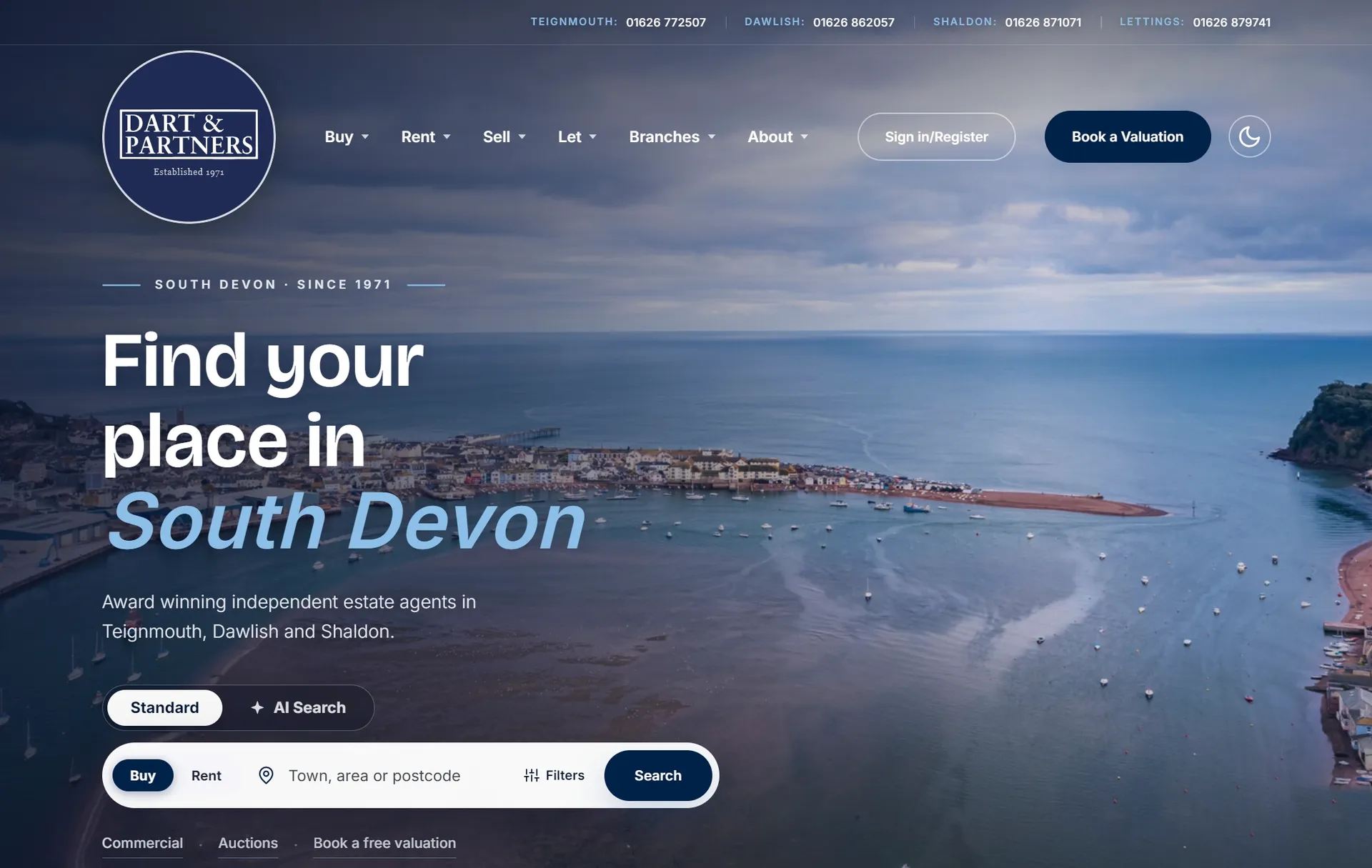
Drag the handle to compare the site they came to us with against the one we built.
Where it started
The old site opened on a stock kitchen and a welcome message. Nothing on the first screen said South Devon, nothing said which of the branches you had landed on, and the search sat below the fold behind the introduction.
Underneath that, the practical problem: three sales branches and a lettings arm were sharing one undifferentiated site, so a seller in Shaldon and a landlord in Dawlish were being handed the same page and left to find their own way.
What we built
The homepage now opens on the estuary itself, with the search in front of it rather than buried under an introduction.
Each branch has its own section, with its own properties, its own team and its own reviews, so a Teignmouth seller is reading about Teignmouth. Lettings has the same, kept separate from sales the whole way through.
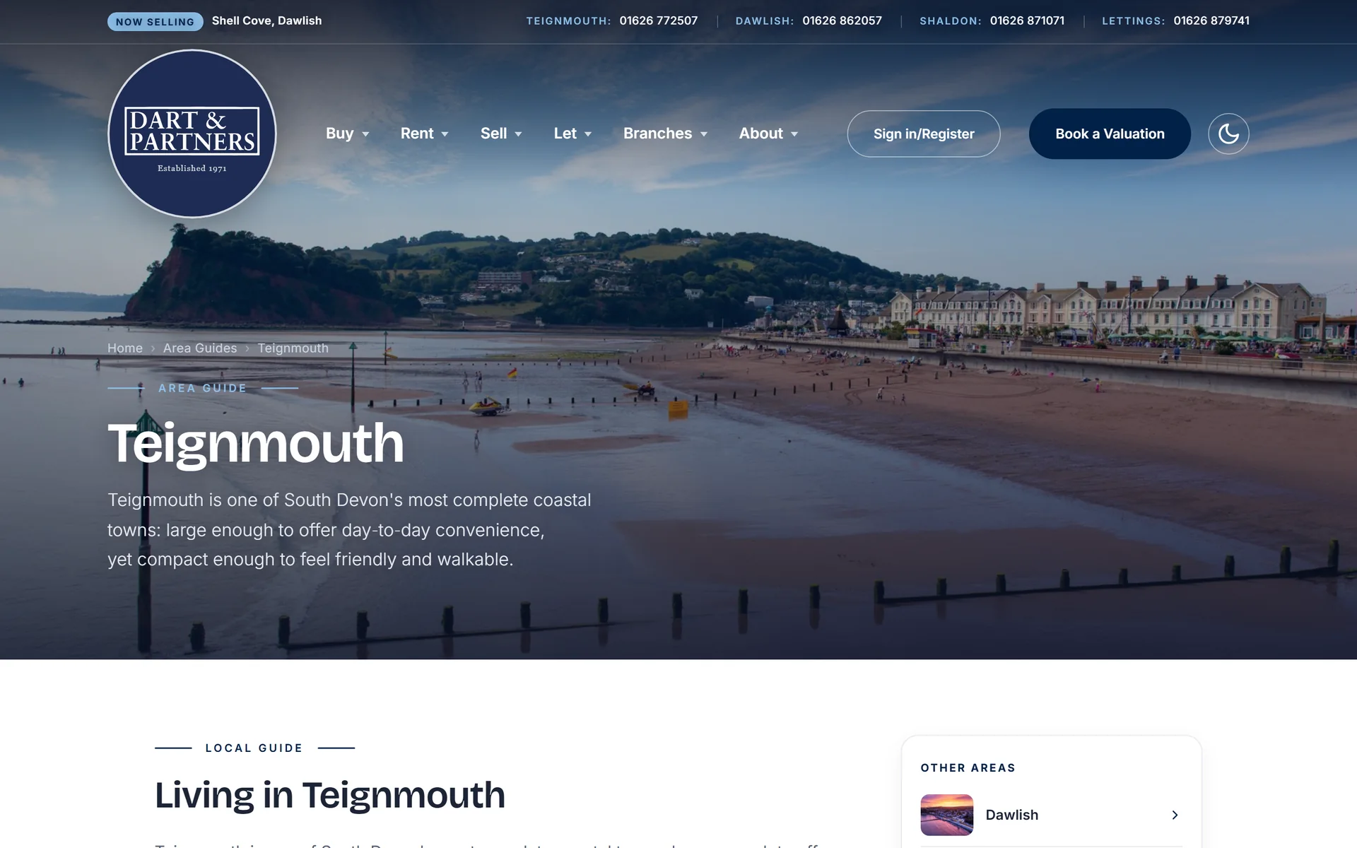
Area guides carry the parts of the job a portal listing cannot: what it is like to live in Teignmouth, Dawlish, Shaldon and the villages inland, written properly and linked from every property in that area.
Ask for it in words, or just say it
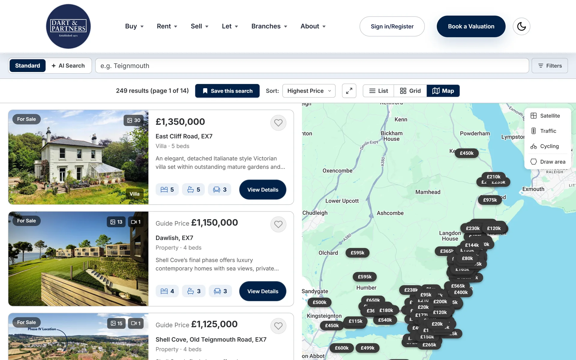
A buyer can work the filters, or they can describe what they are after. The box tells them they may, with the example sitting right there in it: “3 bed house with a garden near Teignmouth under £400k”. Typed exactly like that, it understands. No filter set expresses that sentence, because it carries a type, a feature, a place and a ceiling all at once.
There is a microphone beside it, so the same sentence can be spoken instead of typed. That is the difference between searching at a desk and searching one handed on a train, and it is the part people remember after a demonstration.
The two sit behind a switch rather than in one panel. A box that tries to be a filter and a conversation at the same time leaves people unsure which one they are using, and they stop typing.
Under the bonnet
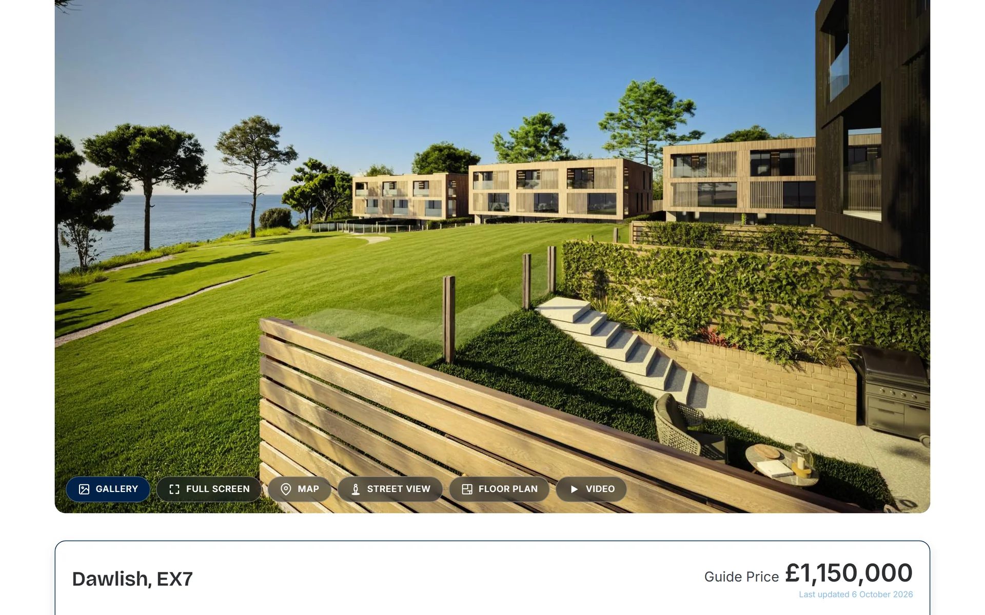
Properties come straight from the agency's own software, so what is on the site is what is on the system, and it goes out to the portals from the same place. Nothing is typed twice.
It runs both ways. A valuation requested on the website arrives in their software as a record, not as an email somebody has to re-key into the system, which is the difference between a lead that gets worked and one that gets remembered.
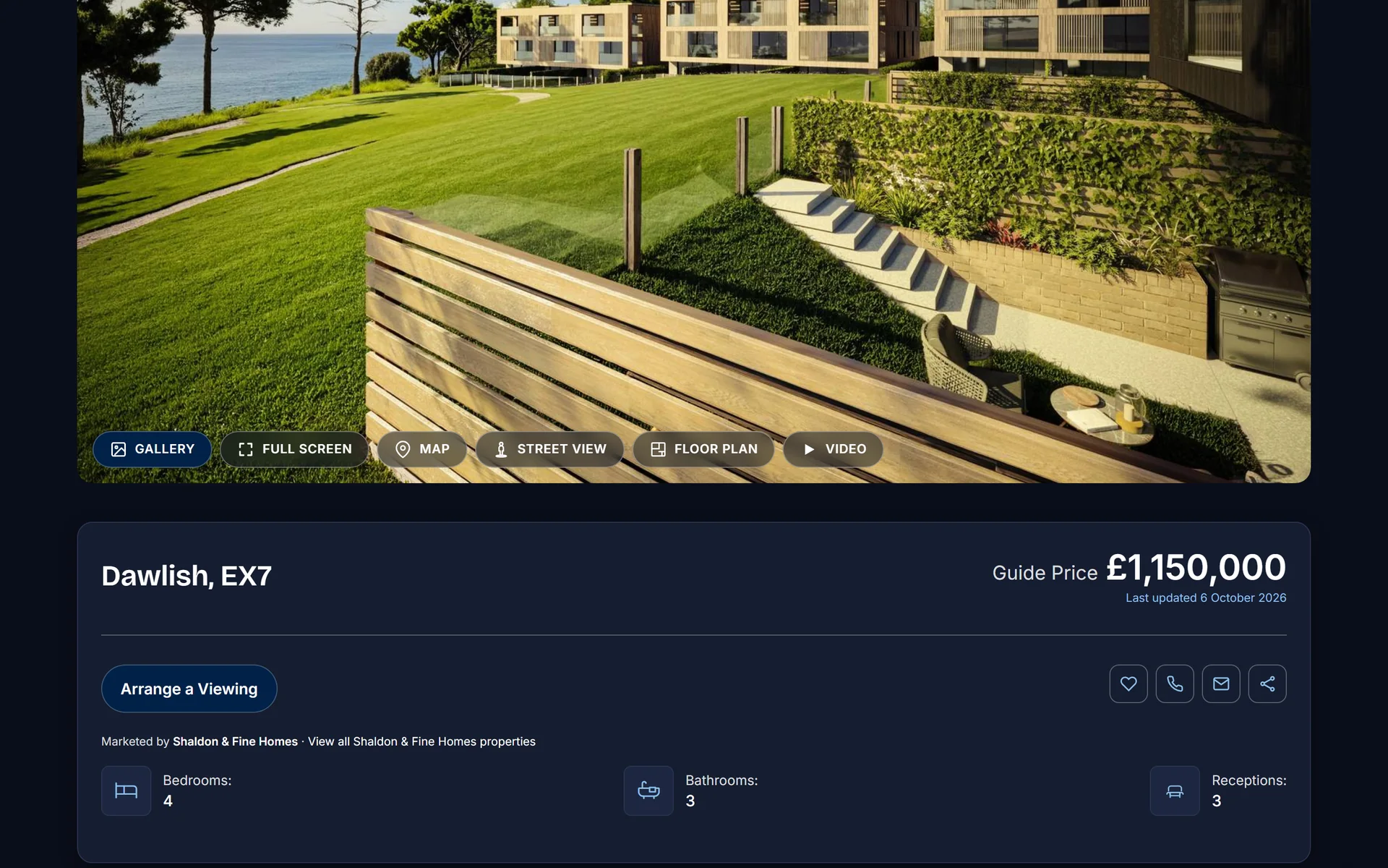
Alongside that sit the things a working agency needs on the web rather than on the phone: property alerts, mortgage enquiries, a mortgage calculator and a stamp duty calculator, auction and fine homes sections, and guides for buyers, sellers, landlords and tenants.
The pages nobody reads until they have to
All of them are there and reachable from the footer: the complaints procedure, a compliance page, landlord and tenant fees, and the Renters' Rights Act set out three ways, an overview plus a separate guide written for landlords and one written for tenants.
The cookie banner puts Reject all next to Accept all rather than behind a settings screen, and it is not decorative. Load the site and leave the banner alone, and the only things it fetches from anywhere else are its own analytics and the reviews feed. The Facebook pixel does not appear until somebody has said yes.
Thanks for all your help and input over last few months. The site is exactly what I'd hoped for.
Inside the site
Ready for your own after?
Send us your current website and we'll tell you, honestly and for free, what's costing you instructions and what we'd do about it.
Get a free site reviewNo obligation. Mon to Fri, 10am to 5.30pm